在 Litmos Blog 中看到一篇文章,名為”Top 6 Tips on Course Design from an instructional Designer”,雖然自己主要的業務不是在教學設計,但是看了之後,真的是心有戚戚焉,作者為Jason Willensky,原文:Top 6 Tips on Course Design from an Instructional Designer
-
 Old news: Make sure your learning objectives are clear and measurable, then make sure that your content and assessment align with your objectives. The current crop of eLearning tools are sensational and feature-laden, but don't lose sight of what's essential to a powerful training experience.
老生常談:確定你的學習目標是清楚而且可衡量的,在教材製作過程中,一定要確保內容、作業、測驗都符合該課的學習目標而去設計的。現在市場上的數位教材製作工具越來越便利,但是,在使用的過程中,切勿忘了實體訓練的教學經驗。
(編註:現在的工具越來越多,也越來越好用,但別忘了不要過度的依賴工具的功能,而忘了教學真正的重點) -
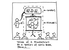 Forget that you ever saw a PowerPoint presentation. Use text judiciously. Use graphics, video, and animation where possible to make your point. Use text to enhance or reinforce.
忘了你曾經看過的簡報演講。有效的使用文字、圖片、影片及動畫去強調課程的重點。
(編註:我想,筆者可能曾經歷過一個全都是文字的無聊演講,才有此想法吧!不過,多運用文字以外的媒體來增加學習的成效,這正是數位學習的核心) -
 Liberate your voice-overs from identical messages in text or graphics. Script in a way that allows the narrator to target what's important about the visual elements on the screen. Your learners don't want to hear a voice reading bullet points.
好好運用聲音表情來輔助學習者於文字及圖片上。旁白的重要性,是用來強調課程中的重點。不過,學生並不想只是像在看KTV一樣的逐字唸法。
(編註:這個觀念非常正確,反觀國內的教材,大部份都喜歡作成像KTV的方式,學習如同催眠,但礙於經費及時間考量,要整個改變,可能客戶對於數位教材的內容需再提昇) -
 Use white space. Don't pack too much into one frame. Same goes for voice; introduce narration after the learner soaks up visual information for a short span of time. Experiment -- not everything has to be simultaneous.
多運用留白。不管文字及畫面,不要將所有的內容全都塞得滿滿的。在一連串的內容或旁白後,應留點時間讓使用者消化。不是每個東西都一定要同時進行的。
(編註:YOU CAN SAY THAT AGAIN!這個問題,從早期的網頁設計到現在的教材設計都看得見,客戶的心態是希望花錢,就要有獲得,在要求廠商將畫面塞得滿滿的,看起來是很豐富,但卻模糊了學習的焦點。從教學的角度來看,在學習過程中,設計一些能讓使用者停下來思考的內容或互動,會效的讓學習者消化) -
 Keep the learner's mouse moving. Even a pop true-or-false question can be an oasis in a desert of one-way information. If you're stuck with dry material, mix it up -- a basic interaction is better than none.
別讓你(使用者)的滑鼠閒著。甚至只是一個另跳的是非題可以讓單向學習變得有趣。如果你只有單一的教學方式,試著搭得不同的呈現及教學方式,畢竟”聊勝於無”
(編註:在數位學習的環境,有天生的限制,因為你不能控制學生乖乖的坐在電腦前,但有時是因為單調的學習方式,才會讓學生想分心。設計一些簡單的互動,可以讓課程有趣,但是,請不要誤解作者的”a basic interaction is better than none”,重點還是要設計跟課程有關的互動) -
 The learner doesn't care about your tools. Think about creating a learning experience that's completely usable, transparent, and effortless for the learner. Get feedback on your efforts, and make adjustments.
學習者才不管你用什麼工具開發。想想,在開發教材時,要如何將教材設計的好用、清楚、容易上手。可多瞭解學習者使用後的感想。
(編註:教材的內容設計,是以學習者考量,當然教材的介面,也一樣要從使用者的角度思考,難用的使用者介面,就算內容再好,也是不會有人想要讀的)
沒有留言:
張貼留言